

Written by me@grafxflow
10 Aug, 2015
0
6,406
UPDATE [10-08-2018]: Bootstrap 4 does this by default now.
When designing and developing with Bootstrap 3 - by default it has always been a case of working with its 12 column grid. But now and then you may have a layout which requires a custom number of equal columns such as 5 which won't work... so what can be done with Bootstrap 3 to get around this?
For this example I want to show 5 equal columns but only for screen sizes tablets and wider. The reason being I can't imagine using 5 equal columns for smaller mobile screens, but if required it could be done.
So lets start by looking at a variation of options using the default 12 grid settings plus below them an example of 5 grids which we want to create.
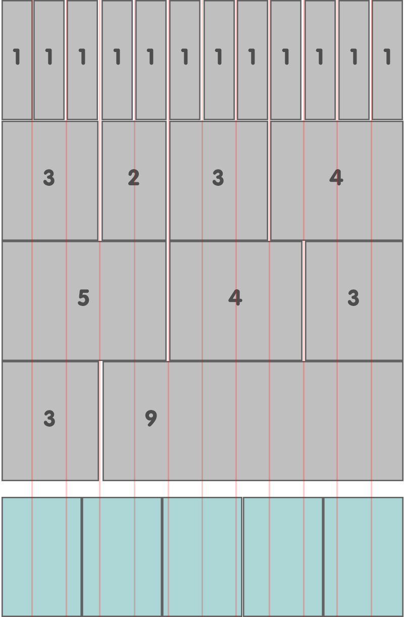
As you can see our 5 columns break all the rules that Bootstrap has by default so lets start sorting this problem.
This is a fairly easy process so start by creating the 5 column structure in the html. Since they have to be different than the default Bootstrap 3 styles we need to add a custom class to the parent div 'row' class - call it 'fivecolumns'.
As for individual columns it doesn't really matter what default Bootstrap 3 class you use, such as 'col-sm-2 col-md-2 col-lg-2'. We are going to change these settings in the CSS by replacing the default width percentages.
One thing to note is that it won't conflict with the actual default 12 grid settings.
<div class="row fivecolumns">

    <div class="col-sm-2 col-md-2 col-lg-2">
        <p>Example content for column 1 of 5</p>
    </div>

    <div class="col-sm-2 col-md-2 col-lg-2">
        <p>Example content for column 2 of 5</p>
    </div>

    <div class="col-sm-2 col-md-2 col-lg-2">
        <p>Example content for column 3 of 5</p>
    </div>

    <div class="col-sm-2 col-md-2 col-lg-2">
        <p>Example content for column 4 of 5</p>
    </div>

    <div class="col-sm-2 col-md-2 col-lg-2">
        <p>Example content for column 5 of 5</p>
    </div>

</div>Below is the custom class containing the fivecolumns CSS. We simply divide the full width 100% by the 5 columns which gives us 20% for each column. But it could be others like 7 columns which would equal 14.28%, 8 columns which would equal 12.5% and so on.
/* Bootstrap 3 fix for 5 columns */

/* Small Devices, Tablets */
@media only screen and (min-width : 768px) {
    .fivecolumns .col-md-2, .fivecolumns .col-sm-2, .fivecolumns .col-lg-2  {
        width: 20%;
        *width: 20%;
    }
}

/* Medium Devices, Desktops */
@media only screen and (min-width : 992px) {
    .fivecolumns .col-md-2, .fivecolumns .col-sm-2, .fivecolumns .col-lg-2 {
        width: 20%;
        *width: 20%;
    }
}

/* Large Devices, Wide Screens */
@media only screen and (min-width : 1200px) {
    .fivecolumns .col-md-2, .fivecolumns .col-sm-2, .fivecolumns .col-lg-2 {
        width: 20%;
        *width: 20%;
    }
}
It's really that simple and I hope you find it helpful.

30 Apr, 2017

09 Aug, 2015

21 Jan, 2007

I am a Full-stack Developer who also started delving into the world of UX/UI Design a few years back. I blog and tweet to hopefully share a little bit of knowledge that can help others around the web. Thanks for stopping by!
Follow
11 Jul, 2023

21 Jun, 2023

25 Nov, 2022

20 Sep, 2022

Views: 162,645

Views: 38,821

Views: 34,615

Views: 31,993

